Time Spent Across Ticket States
The "Time Spent Across Ticket States" metric in the Sprint Reports for Jira app reports utilizes pie charts to visually represent the average time tickets spend in each stage of the workflow, also known as swimlanes. This metric helps teams understand how much time is typically invested in different stages, identify potential bottlenecks, and optimize their workflow for improved efficiency.
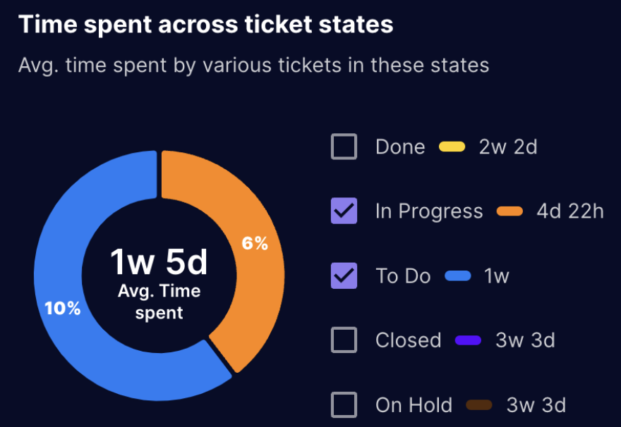
Understanding the Pie Charts
- Each pie chart represents a specific sprint or timeframe.
- The pie chart is divided into slices, where each slice corresponds to a swimlane in the workflow (e.g., To Do, In Progress, In Review, Done).
- The size of each slice is proportional to the average time tickets spend in that specific swimlane relative to the total time spent in all stages.
Interpreting the Data
- A larger slice indicates that tickets typically spend a longer time in that particular swimlane compared to other stages.
- By analyzing the pie charts, teams can:
- Identify bottlenecks in the workflow, such as stages where tickets consistently spend a significant amount of time. This could indicate inefficiencies, waiting periods, or resource constraints.
- Compare the distribution of time across different sprints to track improvements or identify recurring issues.
- Evaluate the effectiveness of implemented changes aimed at improving workflow efficiency by observing changes in the time spent across different stages.