Work Investment
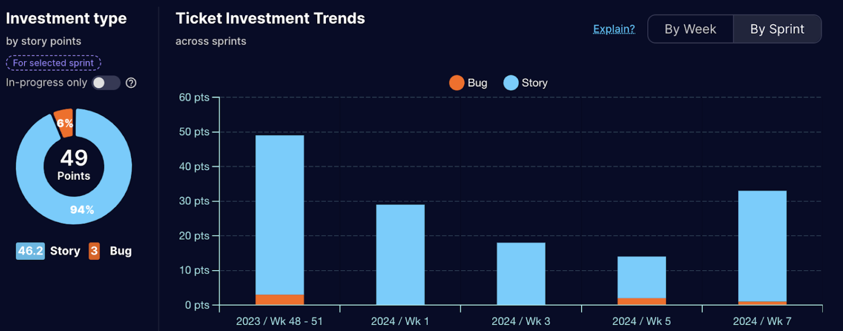
Investment Type Pie Chart
The investment type pie chart in the Sprint Reports for Jira app reports visually represents the proportional distribution of tickets worked on within a specific sprint categorized by their investment type. This metric helps stakeholders understand the priorities and focus areas during the sprint.
Common Investment Types
The types may vary depending on your organization.
- Bugs: Represents tickets related to resolving defects, errors, or unexpected behavior in the software.
- Stories: Captures tickets associated with implementing new functionalities or enhancements to the existing system.
- Tasks: This category may include tickets that don't fit neatly into the above categories, such as spikes, research tasks, or configuration changes.
- Etc.: Other Ticket types as defined by you in Jira
Interpreting the Pie Chart
- The size of each pie slice corresponds to the percentage of tickets that belong to that specific investment type.
- A larger slice indicates a higher focus on that particular type of work during the sprint.
- By analyzing the pie chart, stakeholders can gain insights into:
- The balance between different investment types (e.g., bug fixing vs. new features).
- Whether the sprint focused on addressing technical debt or primarily delivered new functionalities.
- The allocation of resources towards different investment areas.
Investment Trends across Sprints
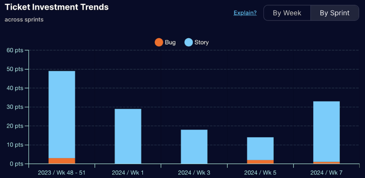 The investment trends stacked bar chart in the Sprint Reports for Jira app reports complements the investment
type pie chart by providing a visual representation of how investment types have changed over multiple sprints.
This chart allows stakeholders to:
The investment trends stacked bar chart in the Sprint Reports for Jira app reports complements the investment
type pie chart by providing a visual representation of how investment types have changed over multiple sprints.
This chart allows stakeholders to:
- Identify trends and patterns: See how the focus on different investment types (e.g., bug fixes, new features) has shifted over time across various sprints.
- Monitor progress: Track if the allocation of resources across different investment types aligns with project goals and strategic priorities over time.
- Compare sprints: Visually compare the investment distribution between different sprints, allowing for better understanding of resource allocation changes and potential areas for improvement.
Chart Components
- X-axis: Typically represents the sprint number or timeframe.
- Y-axis: Represents the total number of tickets or story points (or other relevant measure of investment) across all investment types.
- Stacked bars: Each bar is divided into sections, where each section represents the proportion of tickets or story points belonging to a specific investment type (e.g., bug fixes, new features, technical debt) within that particular sprint.
Interpreting the Chart
- The height of each bar indicates the total investment (tickets, story points) for the corresponding sprint.
- The color of each section within the bar corresponds to a specific investment type.
- By analyzing the chart, stakeholders can:
- Identify sprints with a higher focus on specific investment types (e.g., a surge in bug fixes).
- Spot potential trends such as a gradual increase in technical debt or a decrease in new feature development over time.
- Compare the investment distribution across different sprints to assess changes in priorities and resource allocation.