
Top 7 Jira Dashboard Gadgets to Visualize Your Project Health


6 min read

A well-planned sprint can go off track faster than you can say “stand-up.” Tasks pile up, blockers sneak in, and before you know it, your roadmap looks more like a roadblock.
That's why visibility into your project is crucial. And if you’re using Jira, you already have one of the most powerful agile project management tools at your fingertips. But Jira’s real power comes alive when you start using Jira dashboard gadgets.
Whether you're a project lead, scrum master, or a team member trying to stay in the loop, these gadgets let you turn your dashboard into a command center.

What are Jira Dashboard Gadgets?
Jira dashboard gadgets are customizable widgets you can add to your Jira project dashboard to visualize key project information at a glance. Think of them as bite-sized, interactive reports that help you track issues, sprints, team progress, and other important metrics—all without having to dig through filters or reports.
Now…
Let’s explore the top 7 Jira dashboard gadgets you can add to your project management dashboard to instantly level up your project visibility—and decision-making.
Also check: The Best Jira Plugins for Technical Project Managers
7 Jira Dashboard Gadgets to Visualize Your Project Health
| Jira Gadget | Best For | Type of Visualization | Ideal For |
| Sprint Burndown Gadget | Tracking sprint progress | Line chart | Scrum teams, sprint planning |
| Created vs. Resolved Chart | Monitoring issue backlog | Line chart | Dev teams, backlog grooming |
| 2D Filter Statistics Gadget | Cross-sectional analysis | Table | Managers, workload analysis |
| Velocity Chart Gadget | Forecasting future sprint capacity | Bar chart | Scrum masters, sprint retros |
| Control Chart Gadget | Measuring workflow efficiency | Scatter/Control chart | DevOps teams, delivery optimization |
| Average Age Chart Gadget | Spotting stale or lingering issues | Line chart | Kanban teams, support teams |
| Pie Chart Gadget | Visual summaries of issue breakdowns | Pie chart | Stakeholder reports, project overviews |
1. Sprint Burndown Gadget

The Sprint Burndown Gadget shows how much work your team has completed—and how much is left—against the timeline of the sprint. It's a visual countdown of your team’s ability to deliver on time.
Key benefits:
Tracks progress in real-time
Highlights if tasks are being completed as scheduled
Makes scope creep or under-commitment obvious early on
Best for monitoring spring progress day-by-day.
This gadget is perfect for daily stand-ups, mid-sprint adjustments, and retrospective discussions. If your sprint goal is the finish line, this chart is your race tracker.
2. Created vs. Resolved Chart

This gadget compares the number of issues created versus those resolved over time. It helps teams stay aware of whether they’re clearing more issues than they’re adding.
Key benefits:
Pinpoints if backlog is growing too fast
Encourages timely resolution of bugs and tasks
Helps balance team velocity and load
Best for identifying workload imbalance or backlog buildup
Use this for sprint retros or backlog grooming sessions. If the “created” line keeps winning, you might need to slow down intake or optimize throughput.
3. Two-Dimensional Filter Statistics Gadget

This gadget shows a table where two dimensions intersect—such as assignee vs. issue status, or issue type vs. priority.
Key benefits:
Identifies bottlenecks by user or team
Highlights unbalanced workloads
Fully customizable based on saved filters
Best for cross-section analysis of tasks by assignee, status, or type
Want to see how many bugs are still open and who owns them? This is your go-to. It’s like a mini-pivot table for your Jira issues.
4. Velocity Chart Gadget

The Velocity Chart Gadget shows how much work a team committed to and completed in each sprint, measured in story points. Over multiple sprints, this data can predict how much the team can realistically handle.
Key benefits:
Compares planned vs. delivered work
Supports realistic future sprint planning
Reveals patterns in over/under commitment
Best for measuring team output and improving sprint planning
This gadget is essential for PMs and scrum masters who want to keep sprint goals rooted in data—not hope.
5. Control Chart Gadget
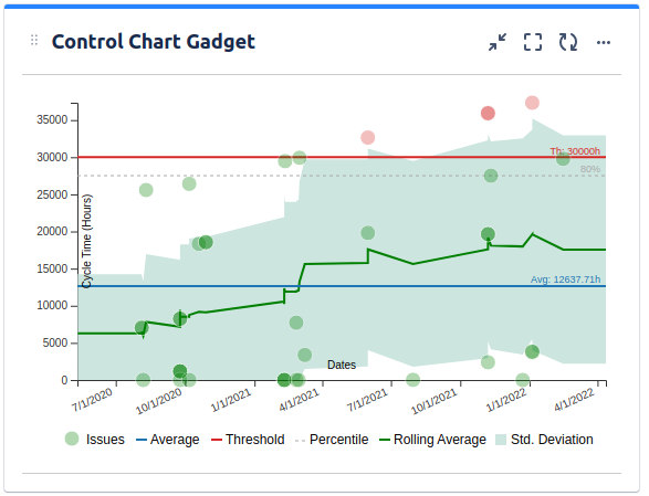
Control charts show how long issues spend in specific stages of the workflow. They give a statistical view of issue cycle times, which is key for spotting delays or bottlenecks.
Key benefits:
Tracks lead and cycle time
Highlights inconsistent delivery timelines
Useful for improving DevOps and agile metrics Best for measuring cycle time and improving workflow efficiency
If you're optimizing your delivery pipeline or implementing continuous improvement, this chart is a must.
6. Average Age Chart Gadget

This gadget tracks the average age of unresolved issues over time. It helps ensure that no task gets forgotten or stuck indefinitely.
Key benefits:
Reveals long-standing issues
Helps teams prioritize older items
Encourages faster resolution and healthier backlog Best for spotting stale or aging issues before they rot
For kanban teams or support queues, it’s especially useful. Nobody wants a bug ticket gathering digital dust.
Also read: Kanban Project Management for Technical Project Managers
7. Pie Chart Gadget
The Pie Chart Gadget turns your filters into a visual snapshot. Want to show the distribution of tasks by priority, assignee, or issue type? This is the gadget you want.
Key benefits:
Simple, visual breakdown of task distribution
Customizable to show any Jira field or filter
Easy to digest—even for non-technical stakeholders Best for high-level summaries for clients, managers, or leadership
Use this on executive dashboards or project overview reports. A well-sliced pie can sometimes say more than a spreadsheet ever could.
Conclusion: Want More Than Just Visualization in your Project Dashboard?
Jira dashboard gadgets are the eyes and ears of your project management dashboard. But sometimes, you need a full health check—not just surface-level vitals.

That’s where Middleware’s Jira Sprint Report comes in.
What makes Middleware Jira Sprint Report Special for your Project Dashboard?
Middleware goes beyond basic visuals and dives deep into:
Sprint-wise performance analytics
Scope creep tracking
Blocker identification
Story point spillovers
Developer contribution insights
Focus factor trends and more
It’s like having a smart assistant for your Jira retrospectives. You get rich data visualizations, actionable insights, and the ability to make smarter sprint decisions in seconds.
Ready to level up your sprints?
Check out Middleware’s Jira Sprint Report today. It’s free to start—and addictive once you do.
FAQs (Frequently Asked Questions)
1. Can I customize Jira dashboard gadgets?
Yes! Most Jira gadgets are highly customizable. You can adjust filters, fields, date ranges, and dimensions depending on the gadget and your permissions.
2. What is the Introduction Gadget in Jira Dashboard?
The Introduction Gadget in Jira is a simple text-based gadget used to display custom messages, notes, or instructions on your dashboard. It doesn’t pull in Jira issue data or project stats—it’s purely informational. Teams often use it to provide context about the dashboard, add links to documentation, or share onboarding instructions for new team members. It's especially helpful when multiple stakeholders access the same dashboard.
3. What is the Jira Roadmap Gadget?
The Jira Roadmap Gadget gives a high-level visual timeline of epics and project progress over time. It’s a Gantt-style view that helps teams and stakeholders track long-term goals, upcoming work, and deadlines in a clear format. Best used by product managers, program leads, and execs, it provides insight into what’s being worked on and when it's expected to finish—all without diving into sprint-level detail.